
Color is an essential aspect of design and content creation, and it is important to make sure you are using color in a way that doesn’t create barriers for users with disabilities.
Why do we need to know about color use & accessibility?
Ensuring color is accessible is a key aspect of accessibility that benefits all users, including those with low vision and color blindness. The most common form of color deficiency, red-green color deficiency. Using ONLY colors such as these (especially to indicate required fields in a form) will make it more difficult for site visitors to understand the meaning and messaging of your site.
Best Practices
Strive to meet WCAG 2.1 A/AA contrast minimum requirements for color contrast
- Color should not be the only visual means of conveying information, indicating an action, prompting a response, or distinguishing a visual element.
- Instructions provided for processes should not solely rely on the color of an element on the screen.
Examples
Color contrast
WCAG 2.1 requires a contrast ratio of at least 3:1 for graphics and user interface components.
Insufficient Color Contrast

Sufficient Color Contrast

Color use in non-text visual elements
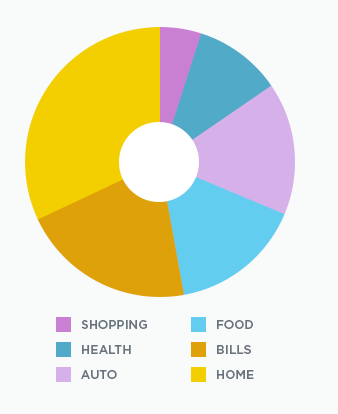
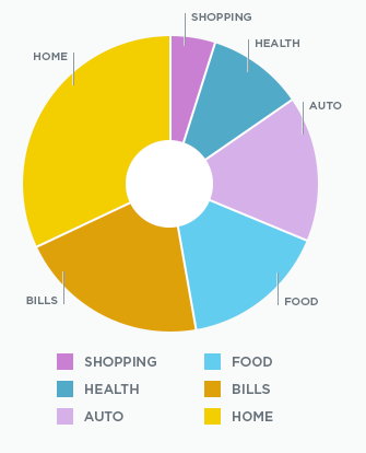
The following are pie chart examples showing categories like shopping, health, auto, food, bills, home. One image shows a poor example of a pie chart using color as the only section indicator. The second column shows a better example of a pie chart using dividers and text indicators.
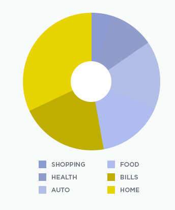
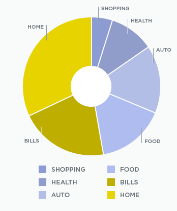
The next set of pie charts are shown as seen by someone with deuteranopia. Deuteranopia means that someone can’t perceive green light.
- They mostly see blues and golds.
- They may confuse some shades of red with some shades of green.
- They may confuse yellows with bright shades of green.
One image shows a poor example of a pie chart using color as the only indicator. The second column shows a better example of a pie chart using dividers and text indicators.
How to check for accessible color contrast
Having good color contrast does not mean that you have to use black and white text. We recommend using a tool to check the contrast.
Color Contrast checkers
Use the Standard Contrast Checker, by WebAIM, to check the color contrast of elements on your screen. Click on the Color Picker and use the eyedropper to extract color value of any element on your screen.
Use the Link Contrast Checker, by WebAIM, to check color contrast of links that are identified only by color (we recommend adding another identifier such as underline to show links). Click on the Color Picker and use the eyedropper to extract color value of any element on your screen.
WAVE accessibility checker
WAVE is a tool, by WebAIM, that helps authors make their web content more accessible to individuals with disabilities. WAVE can identify many accessibility and Web Content Accessibility Guideline (WCAG) errors, but also facilitates human evaluation of web content. Enter your site’s URL in the web checker or download the browser extension to get started.